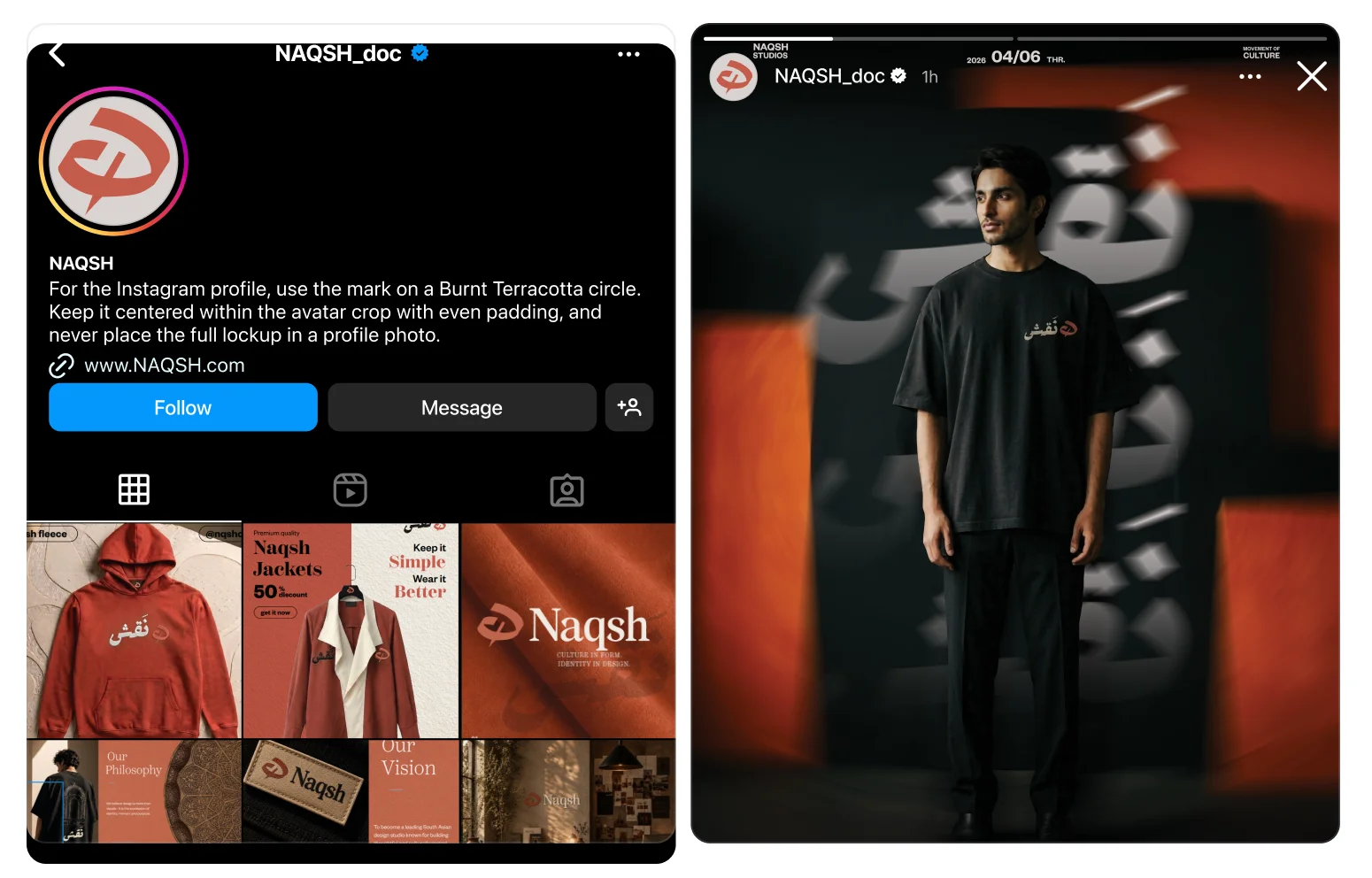
A calligraphic mark with a modern voice.
Naqsh · Brand Identity · 2024
- Brand Strategy
- Logo & Identity
- Visual System
- Brand Guidelines
The brief
The problem: a South Asian fashion brand whose ambition outran its visuals, in a market that offers only two costumes: ornate tradition or imported minimalism. Naqsh needed a third way.
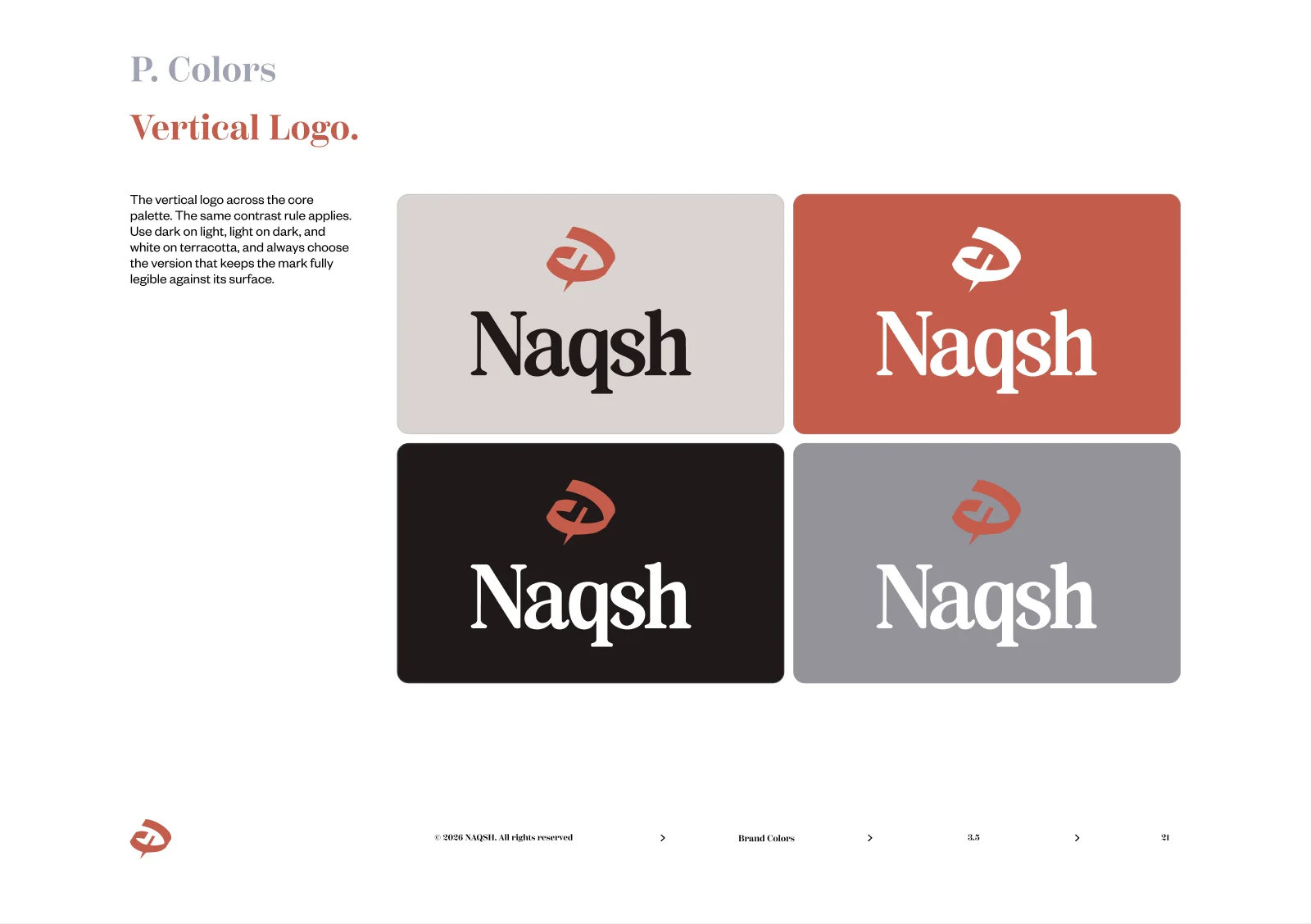
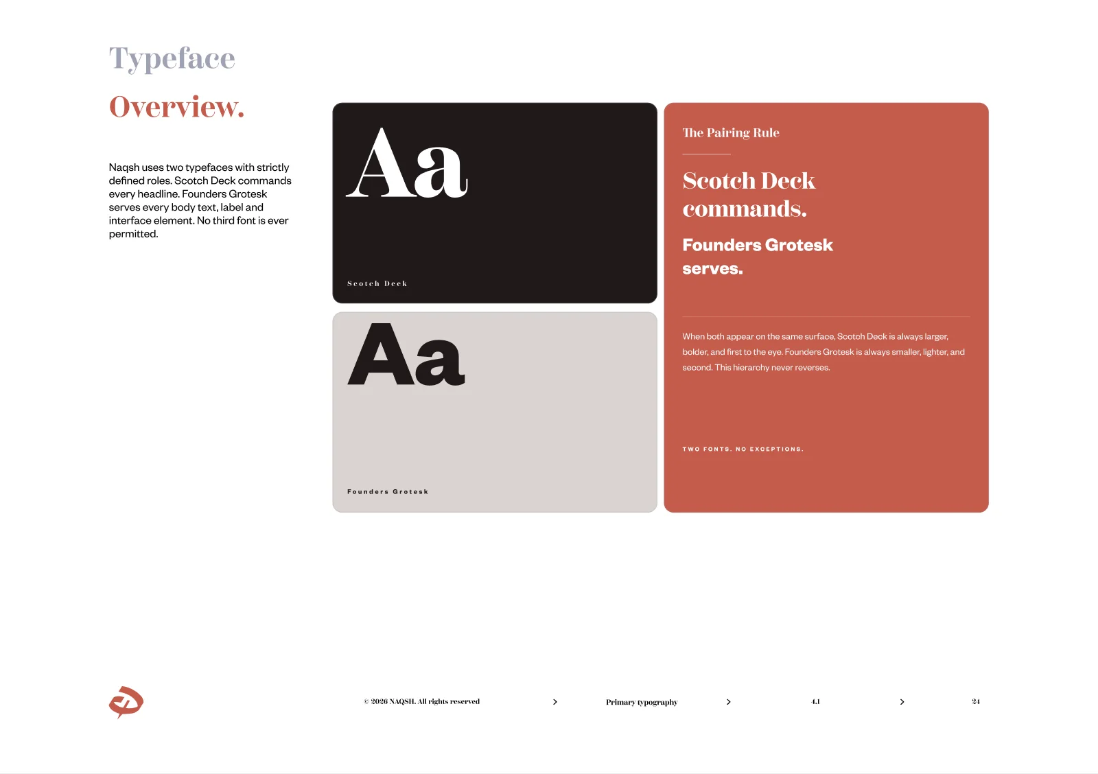
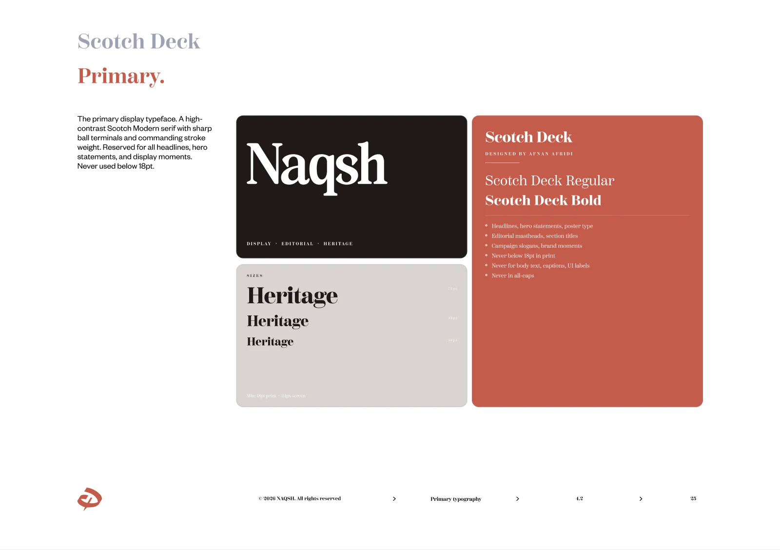
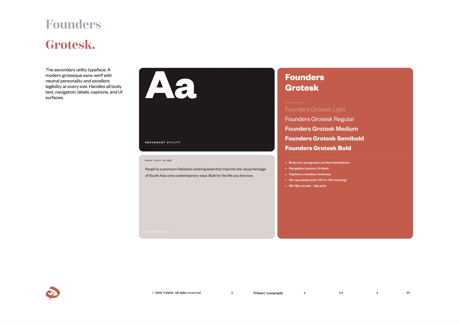
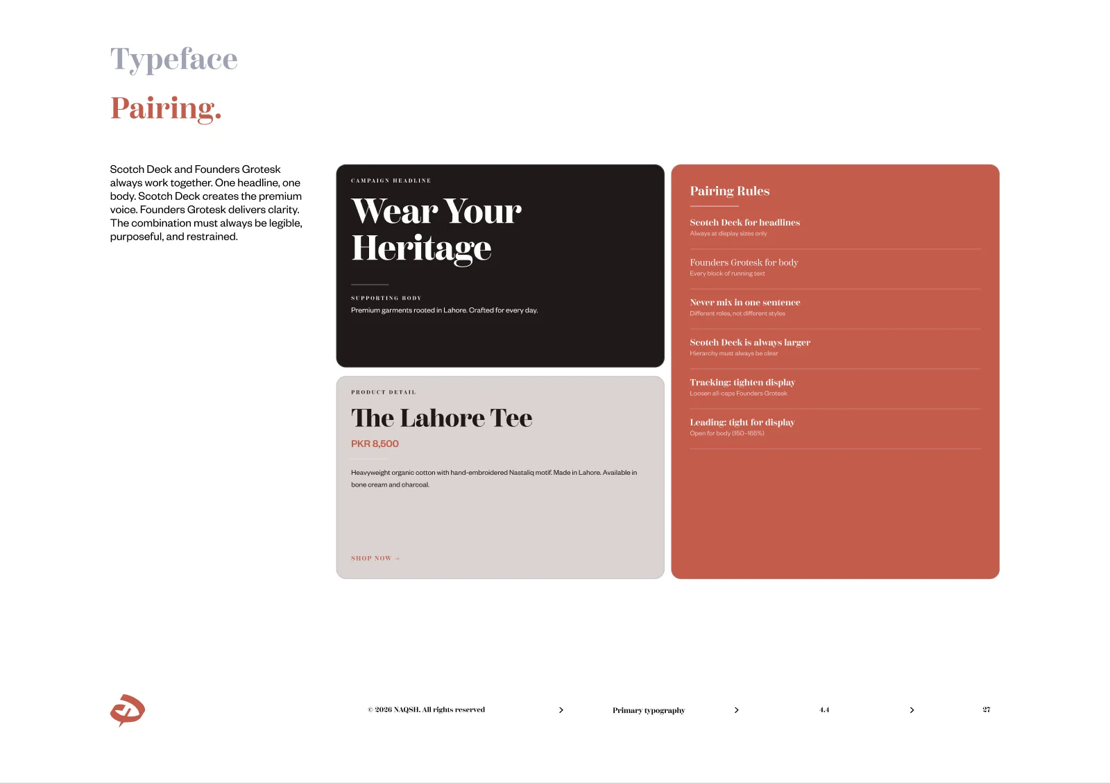
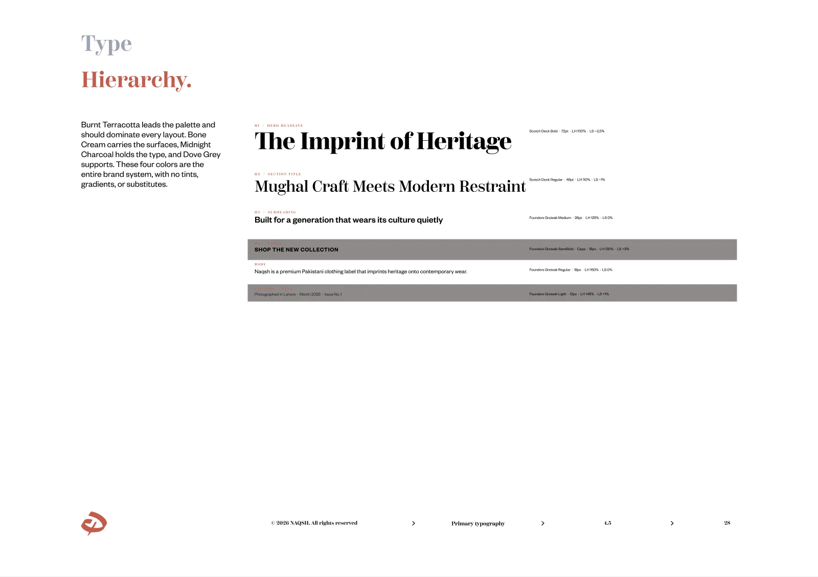
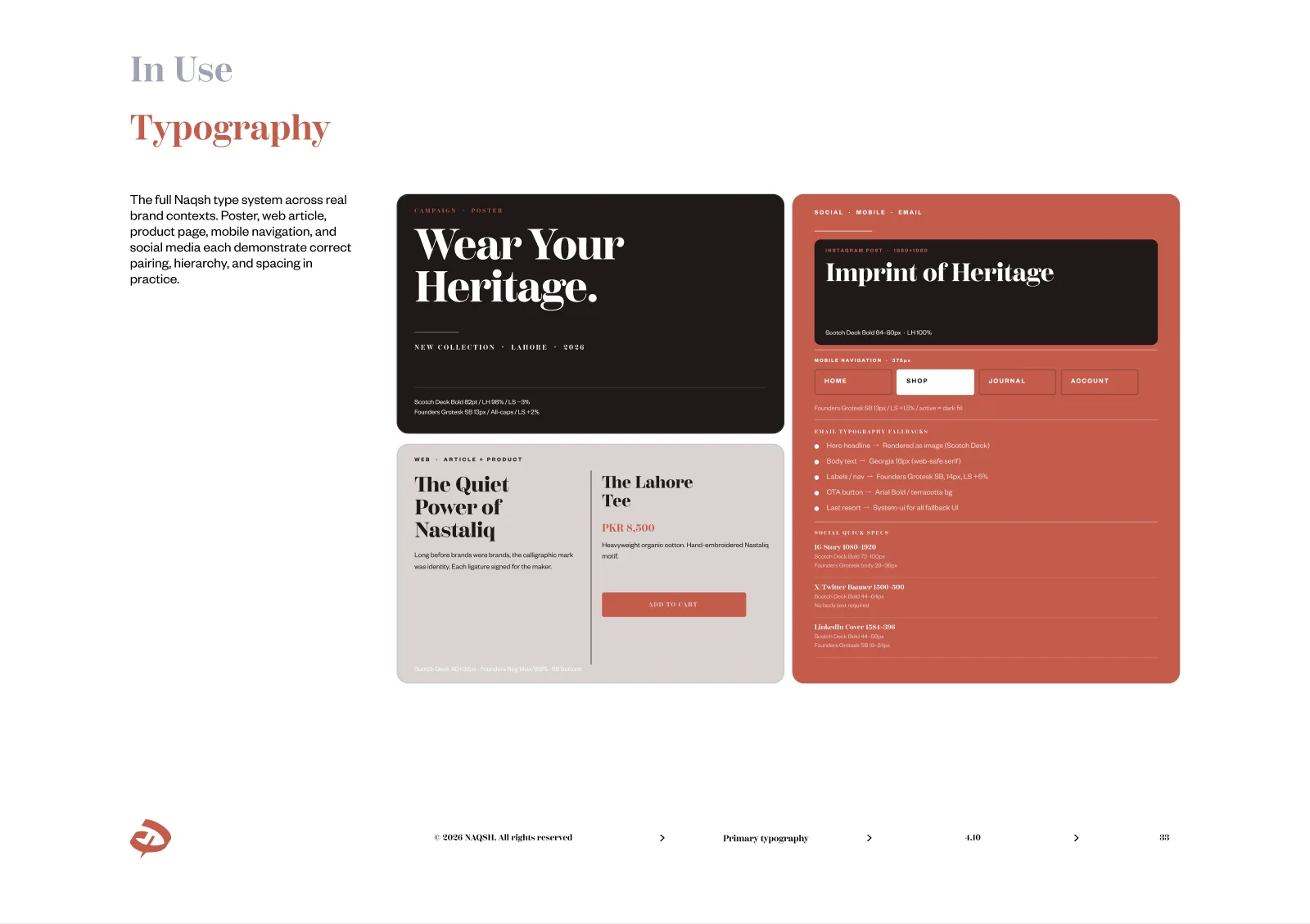
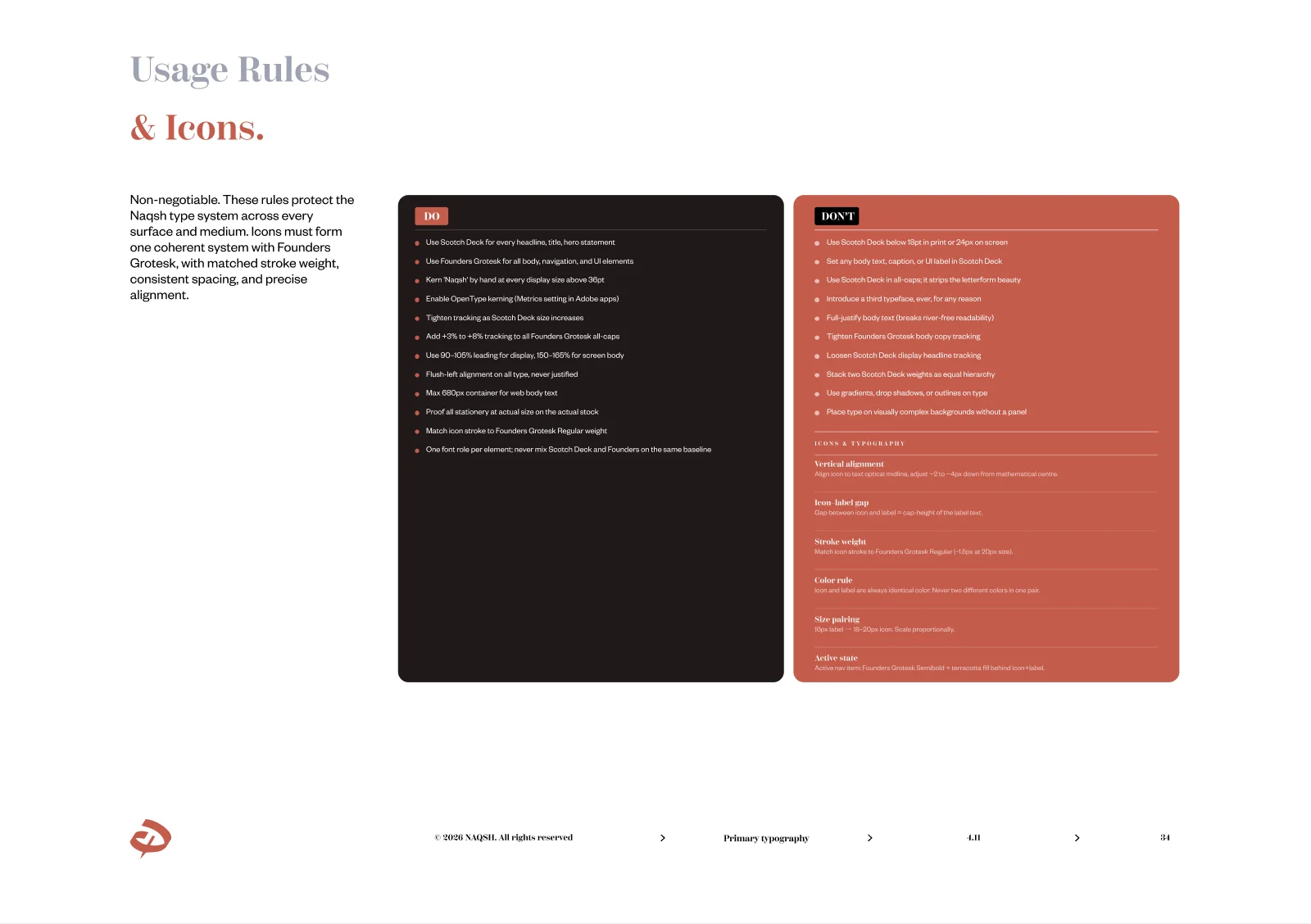
The direction is called Modern Mitti: the materials of the region carried with editorial restraint. From it came a calligraphic mark drawn out of the Arabic نقش, a burnt terracotta palette, and a bilingual type system pairing Scotch Deck with Founders Grotesk.
The work below runs in order: the direction, the stylescapes that were tried and rejected, the drawing of the mark, and the printed guideline that keeps all of it disciplined.
01The Direction: Modern Mitti
South Asian fashion branding usually swings between two poles: heavy ornate tradition, or imported Western minimalism with the culture stripped out. Both leave money on the table. Modern Mitti holds both at once: the material truth of the region, handloom, clay, ink, paper, brass, raw cotton, translated through the language of editorial fashion: restraint, whitespace, magazine typography, considered crops. Earth and editorial. Rooted and restrained.
02Stylescapes: Tried, Rejected, Chosen
Full visual directions were built as stylescapes, colour, typography, photography and texture working as one system, then judged against the direction. Two were rejected; the third became the brand. The rejected boards stay in the record, because finding a voice includes the voices you turn down.



03Drawing the Mark
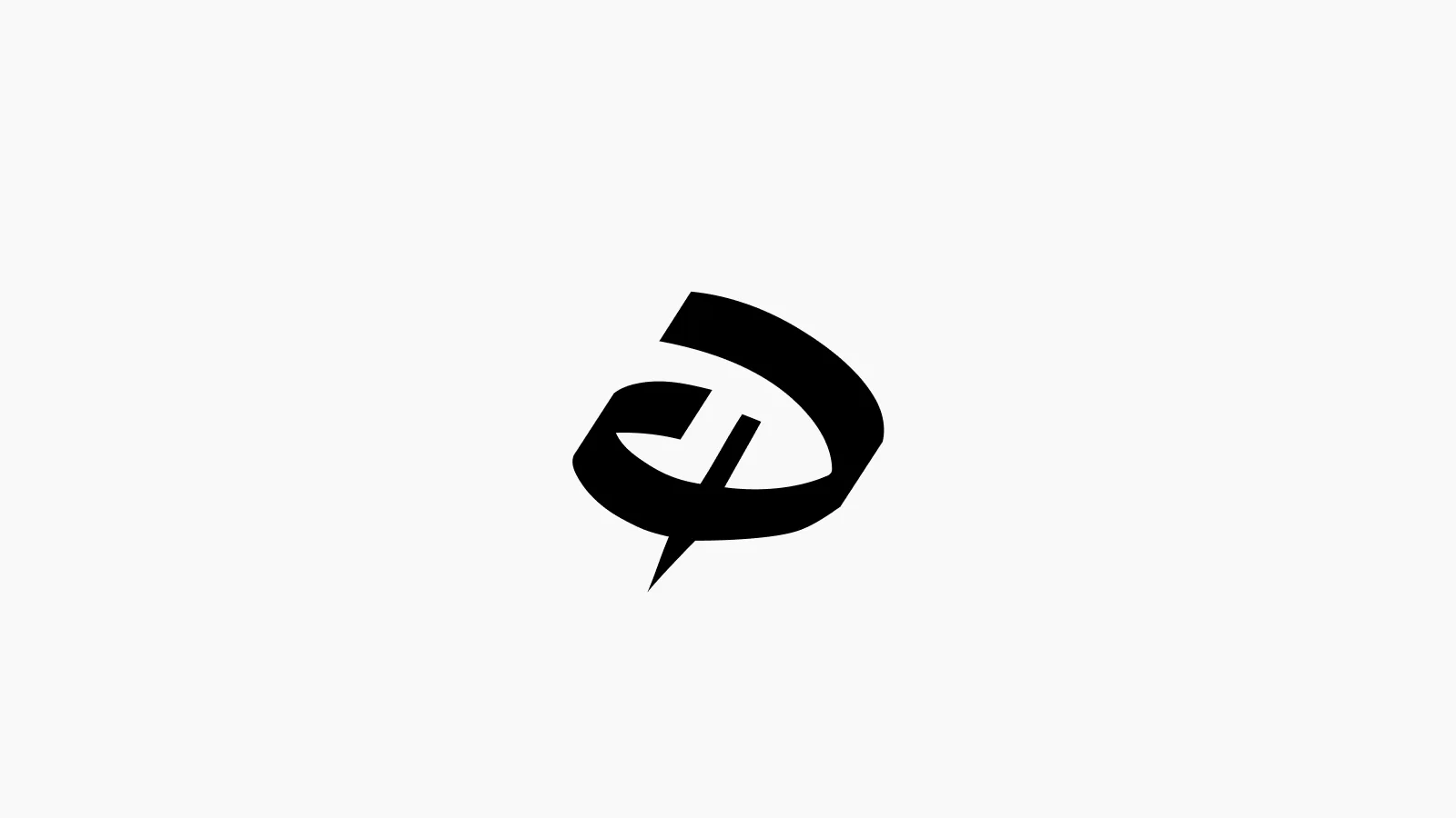
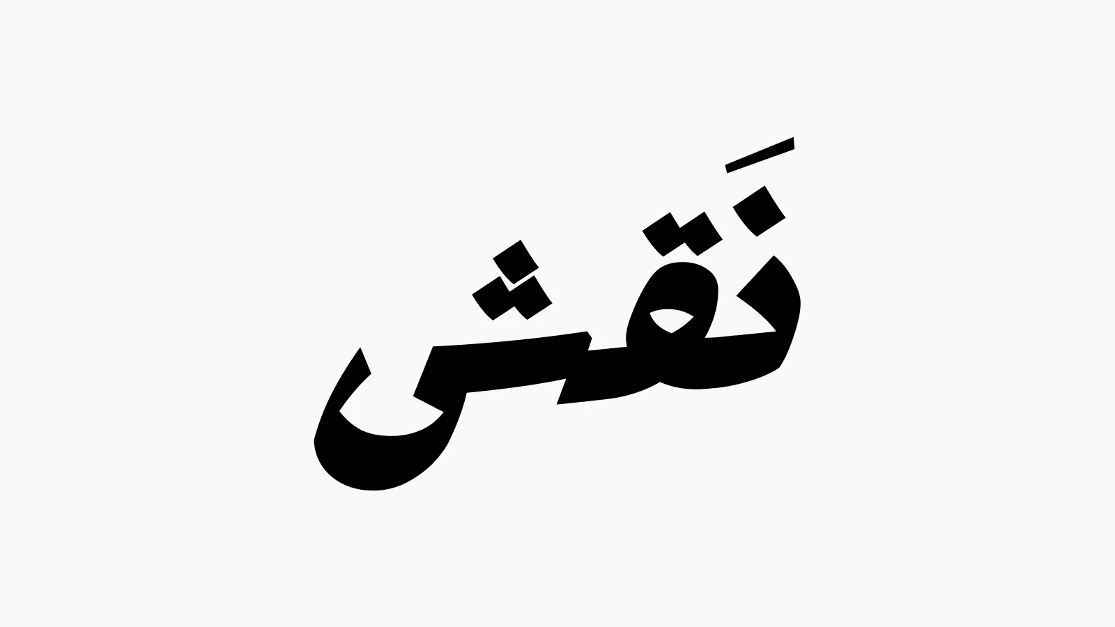
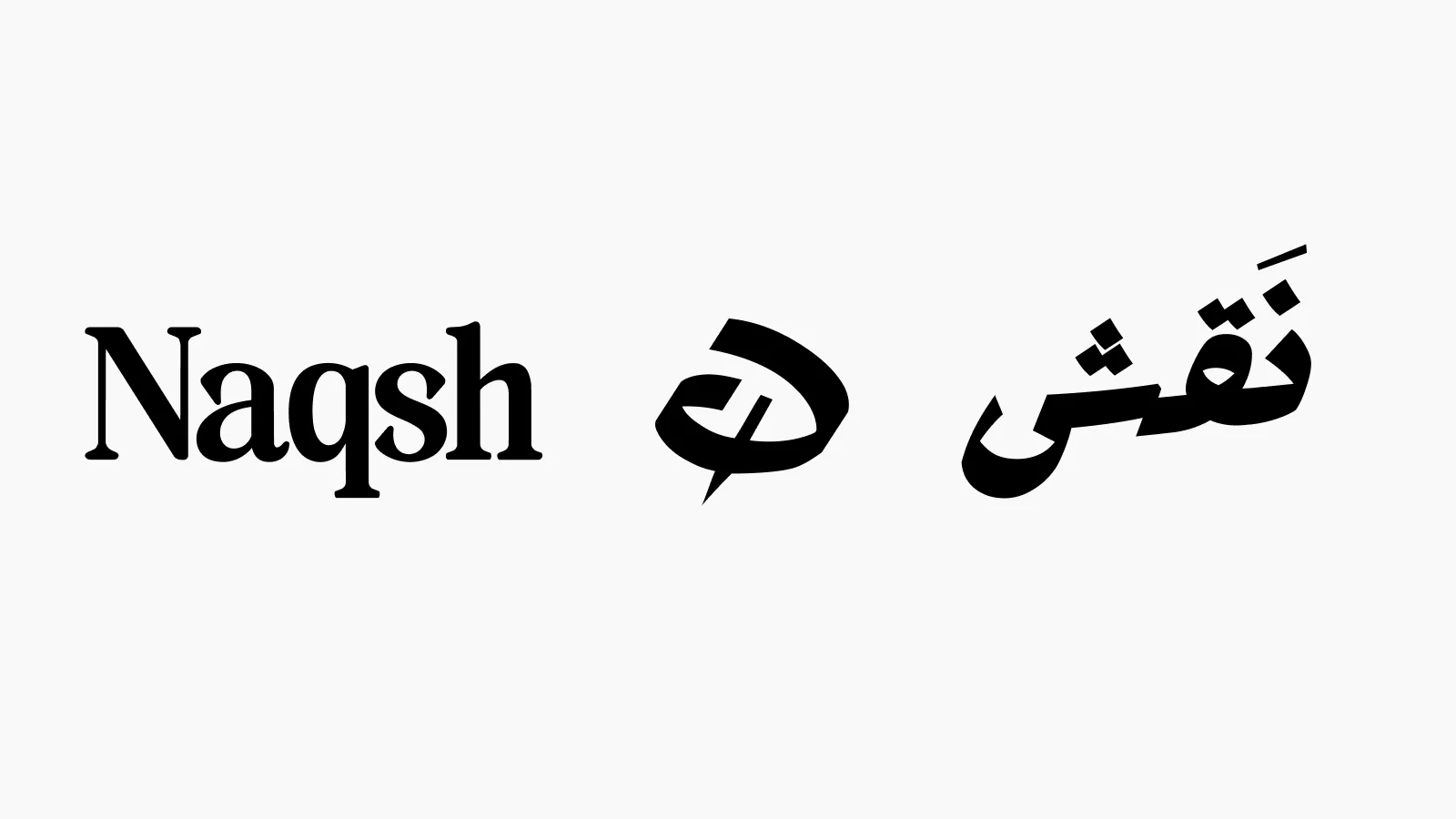
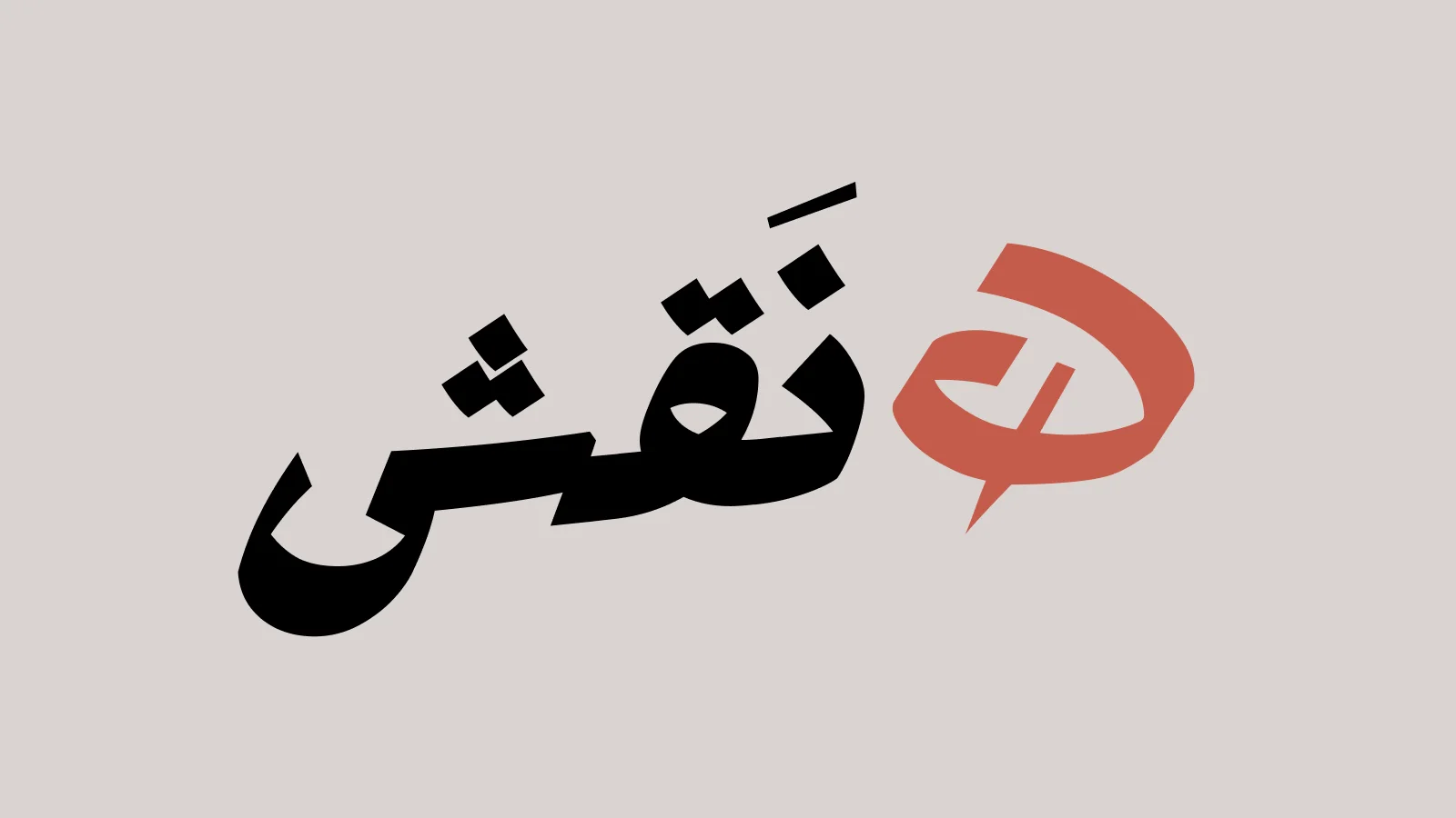
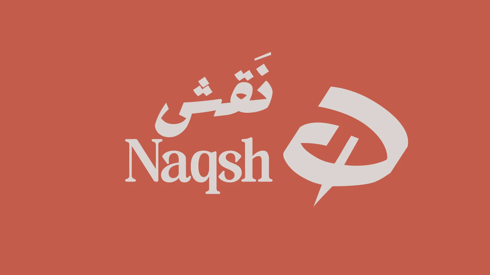
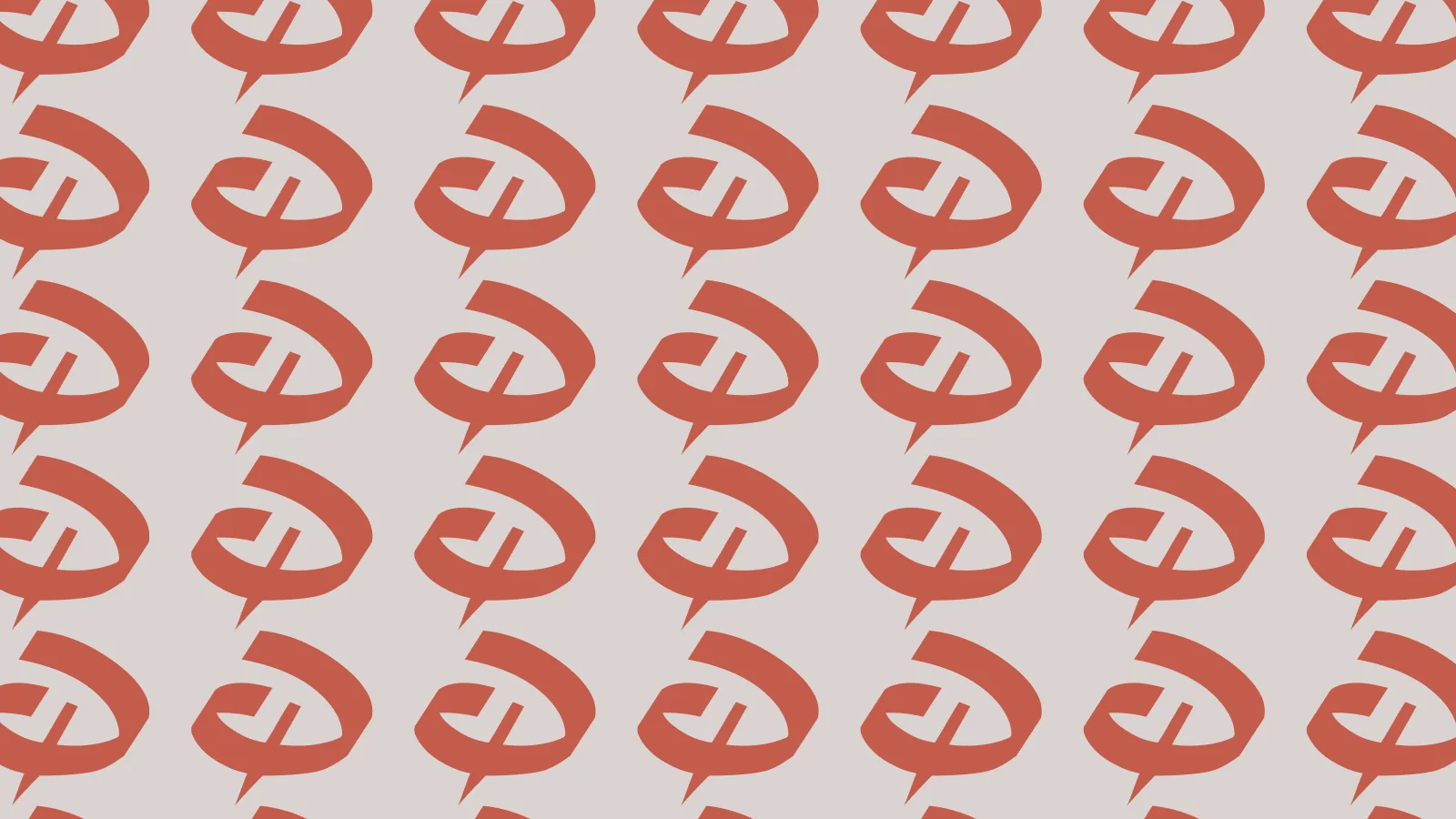
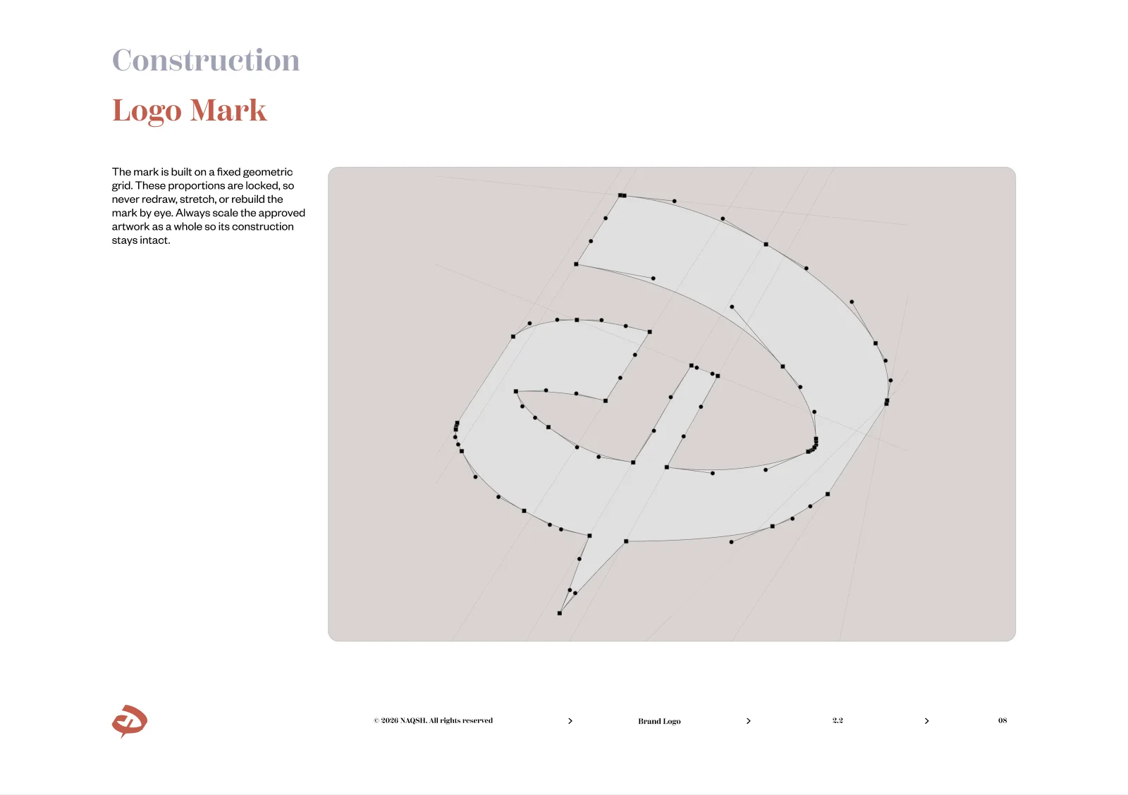
The mark grows out of the Arabic نقش, carved down until one stroke carries both script and speech mark. It has to work alone, beside the Latin wordmark, and repeated as pattern.
04The Book: Brand Logo
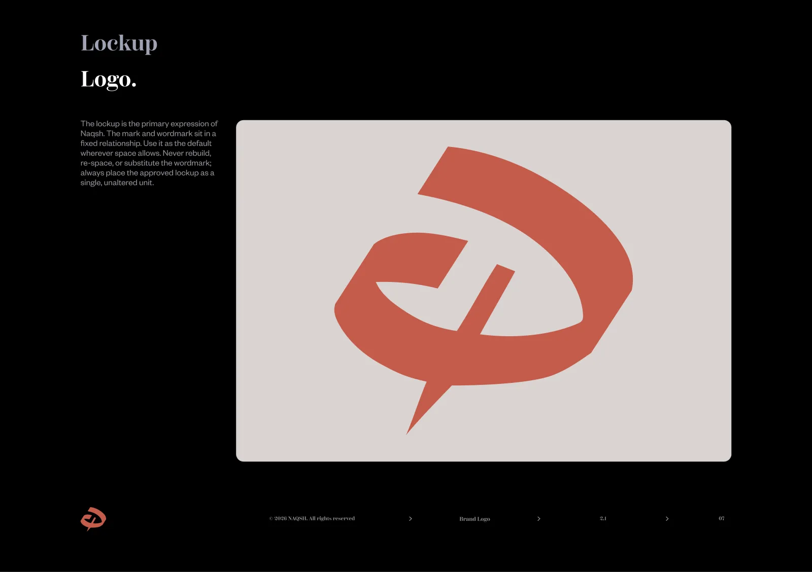
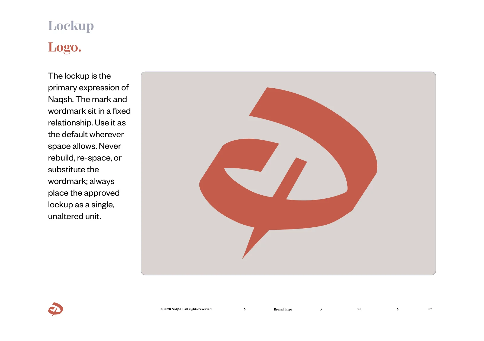
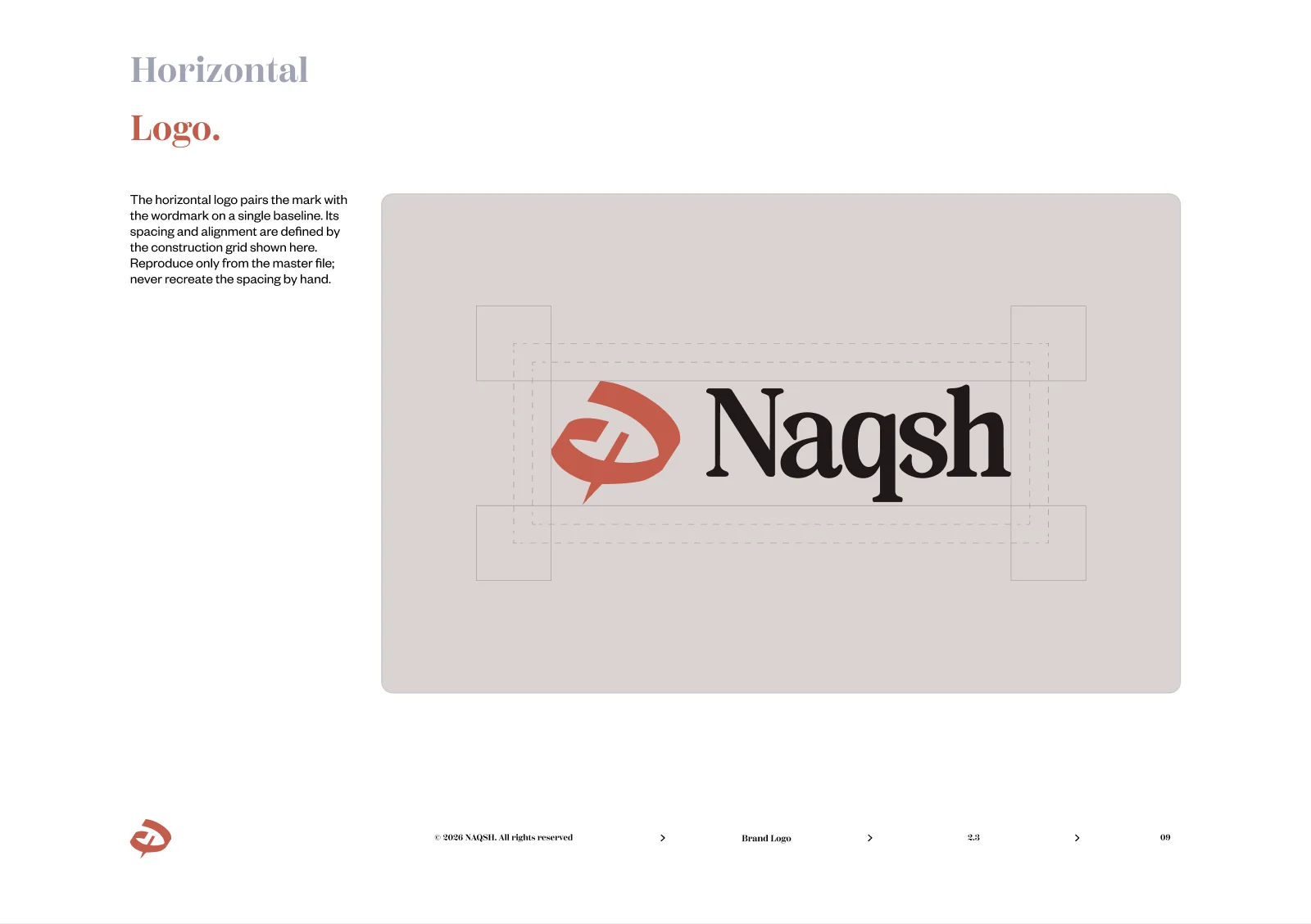
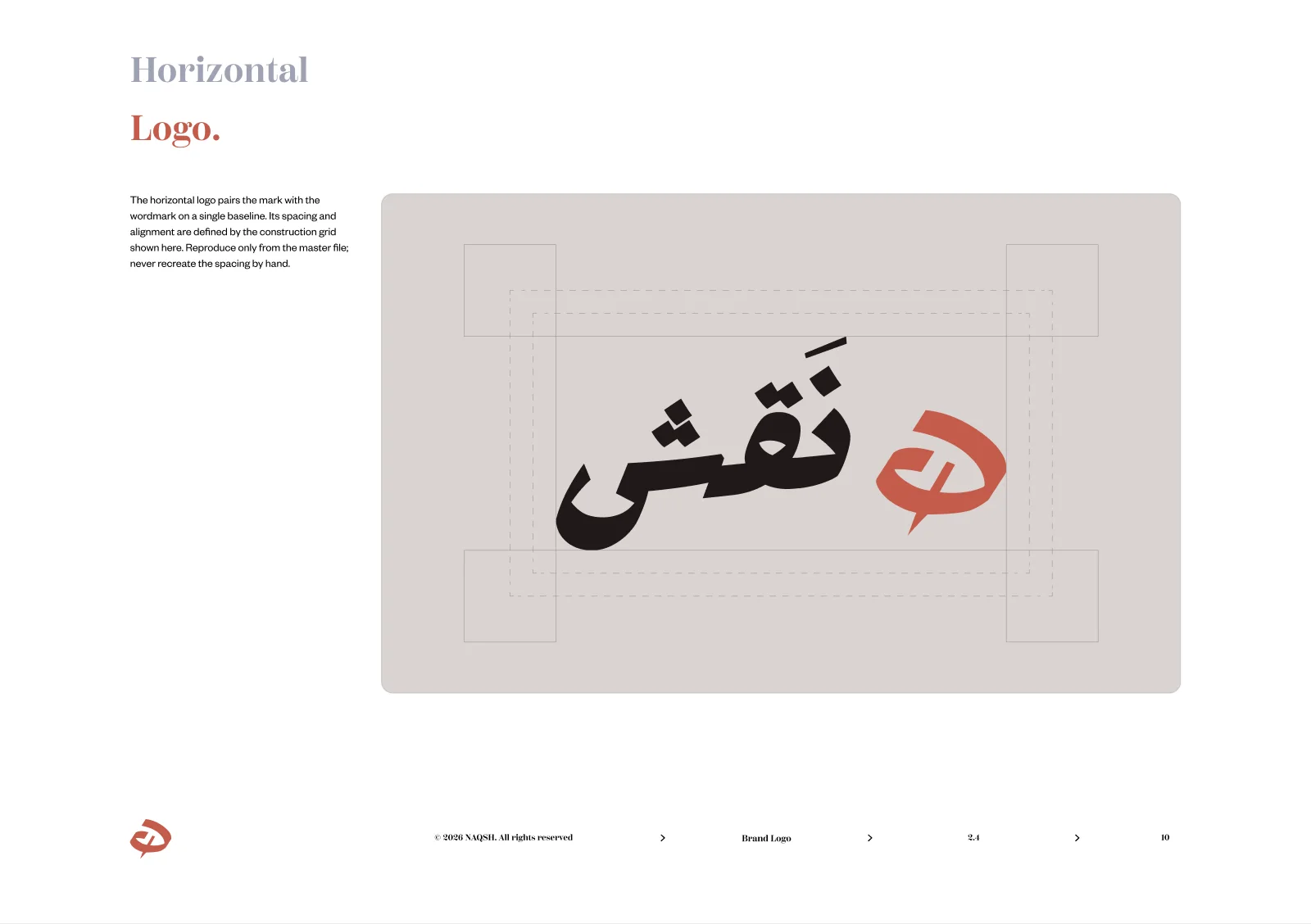
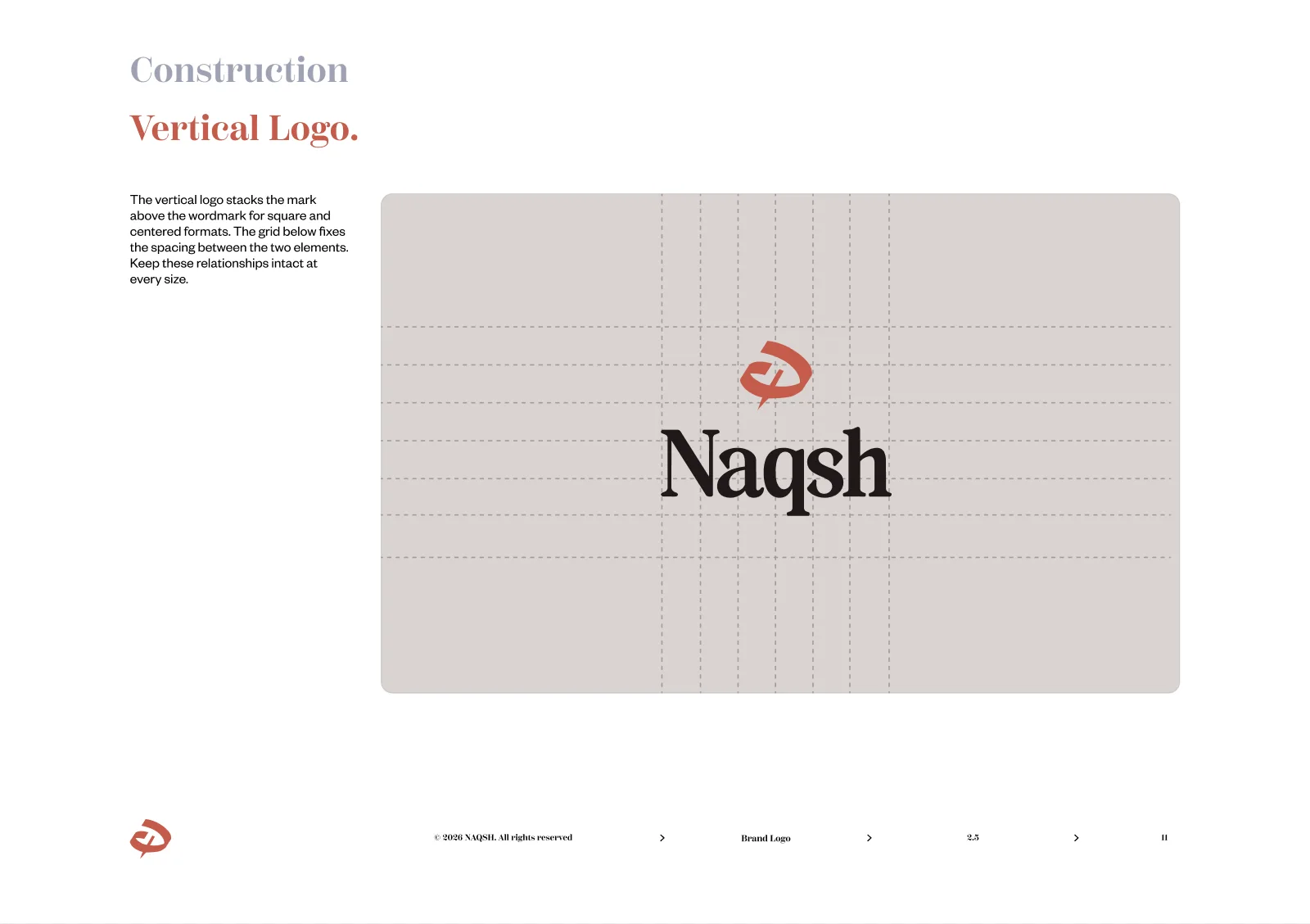
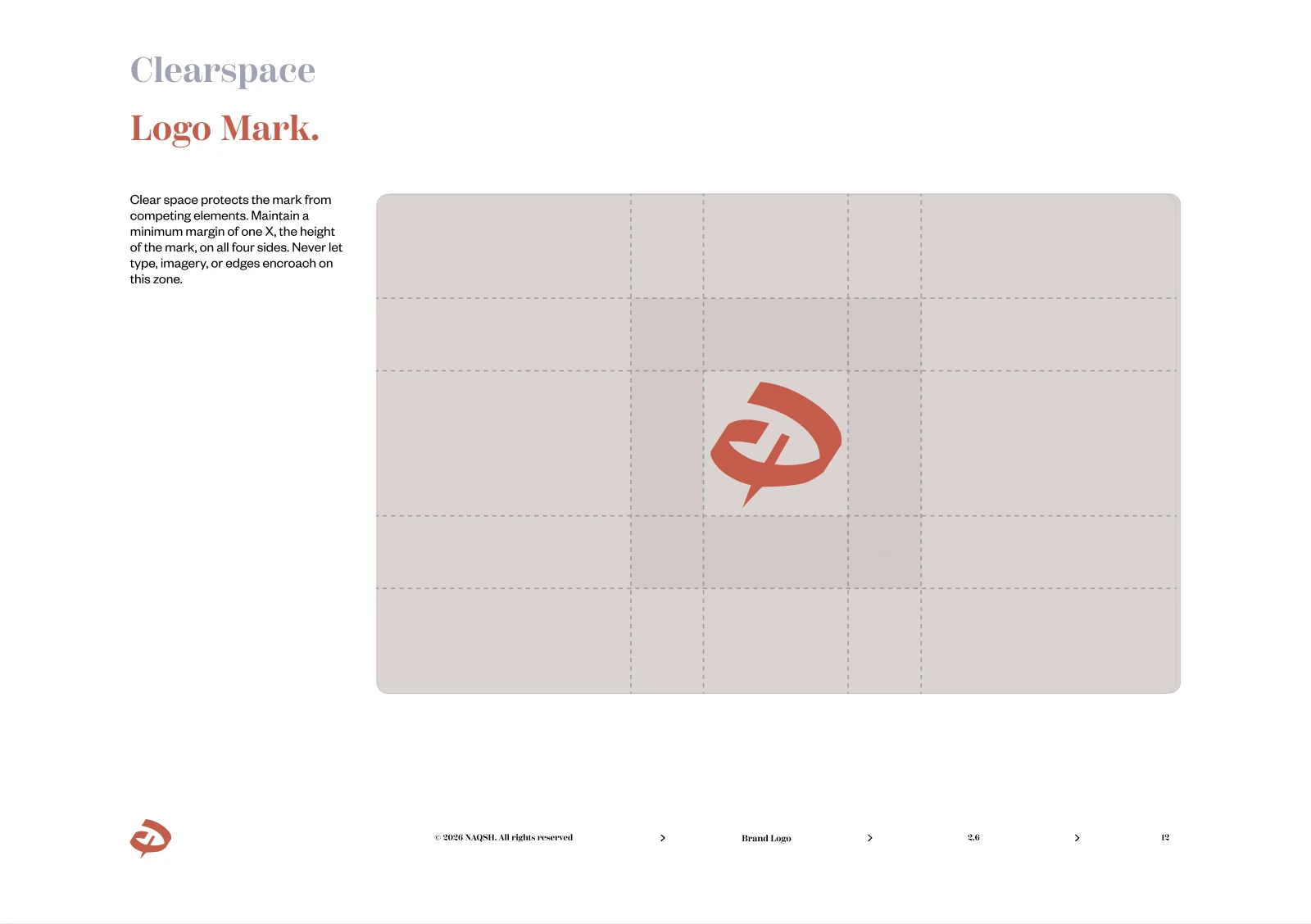
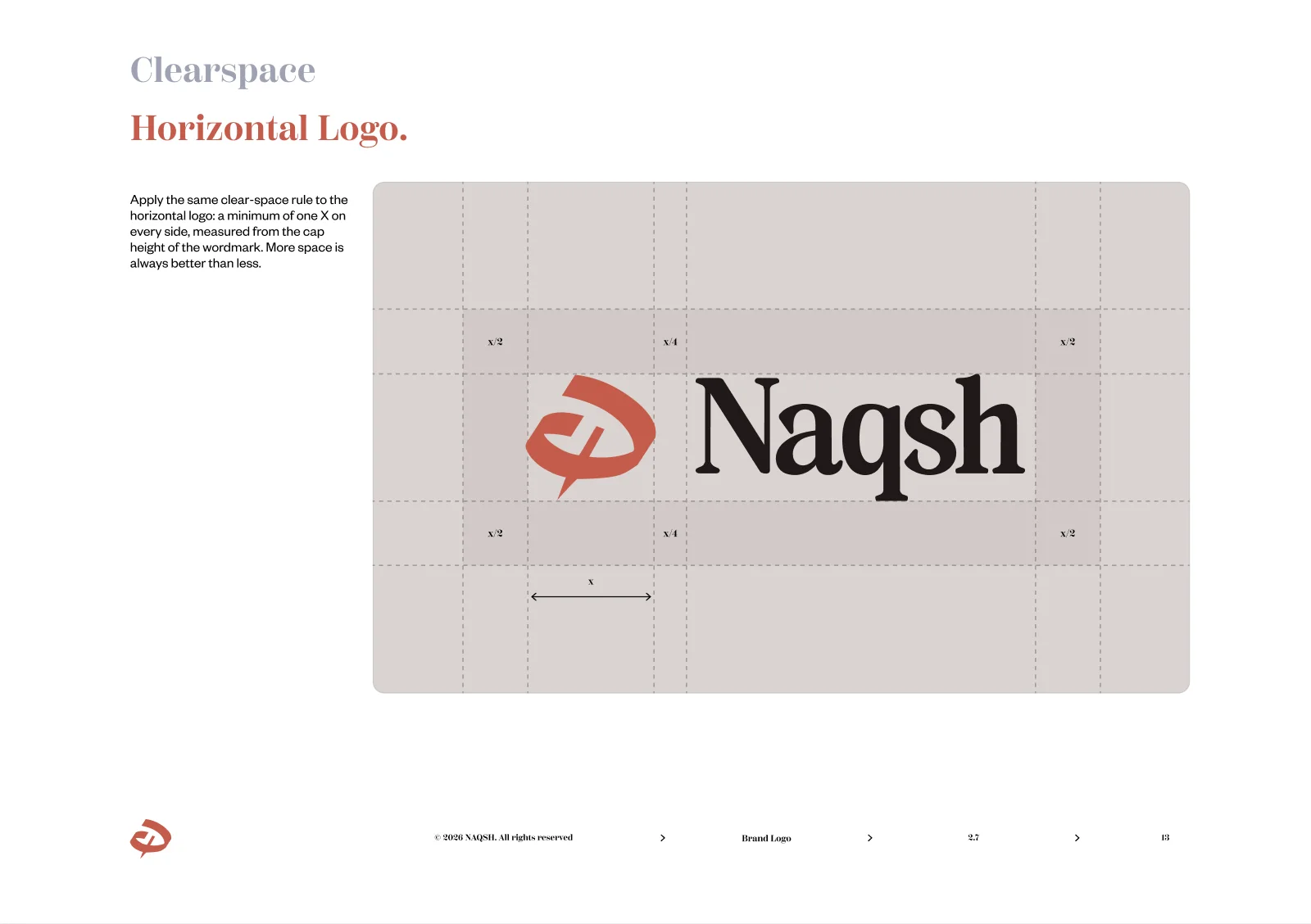
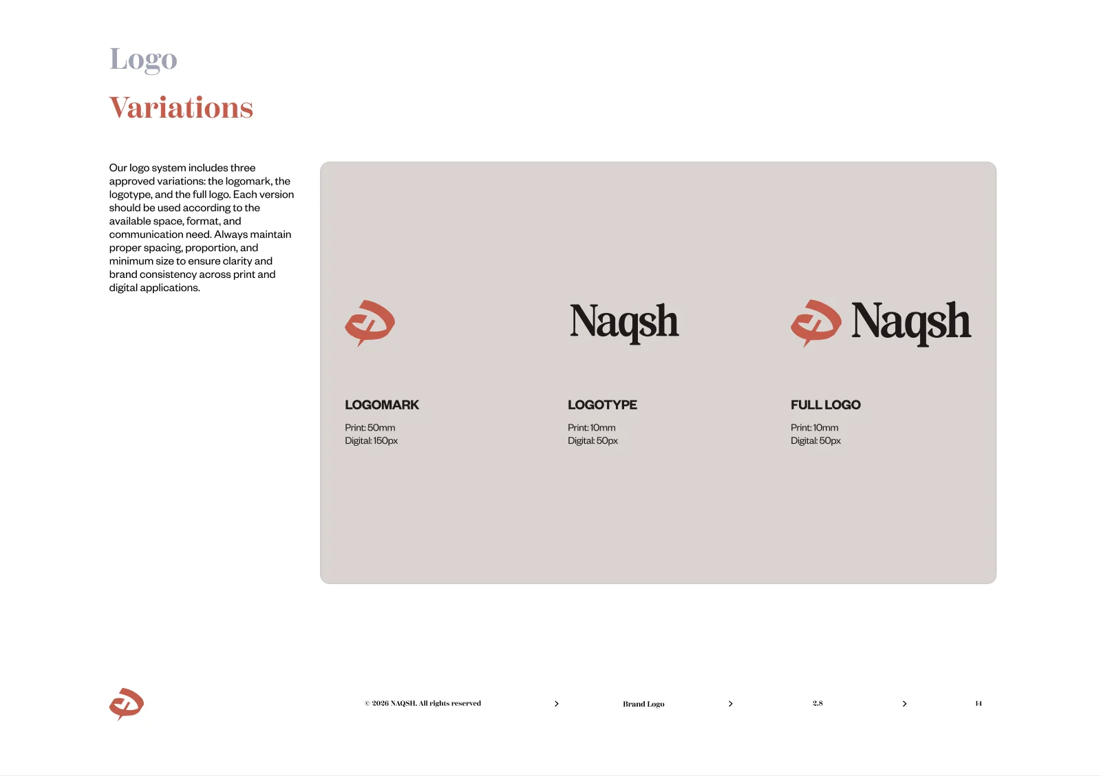
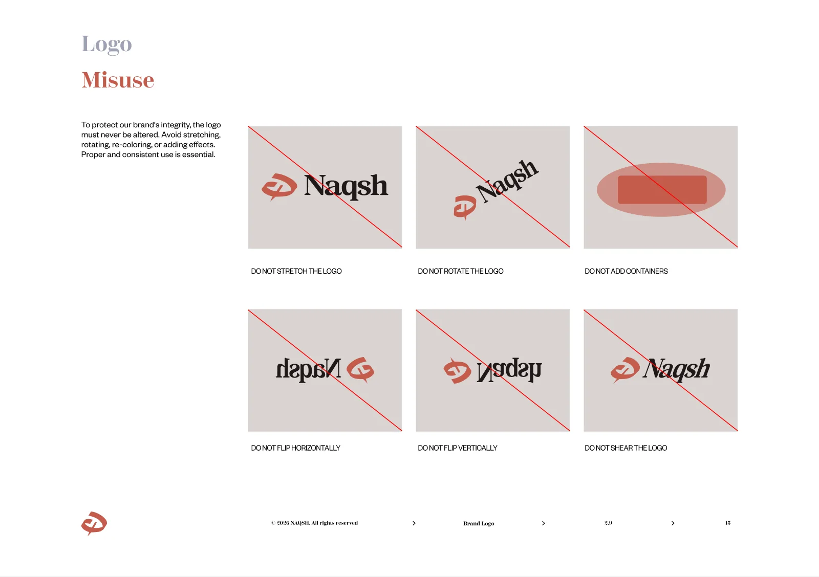
The system ships as a printed guideline in the brand’s terracotta, from lockup and construction to clearspace, variations and misuse.
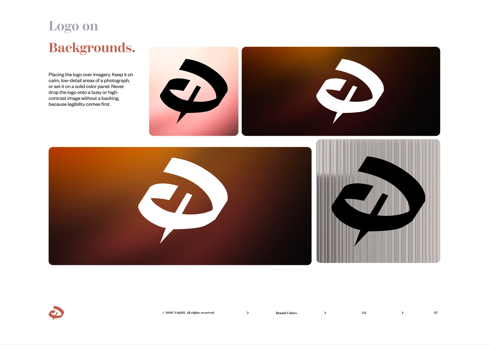
05The Book: Colour
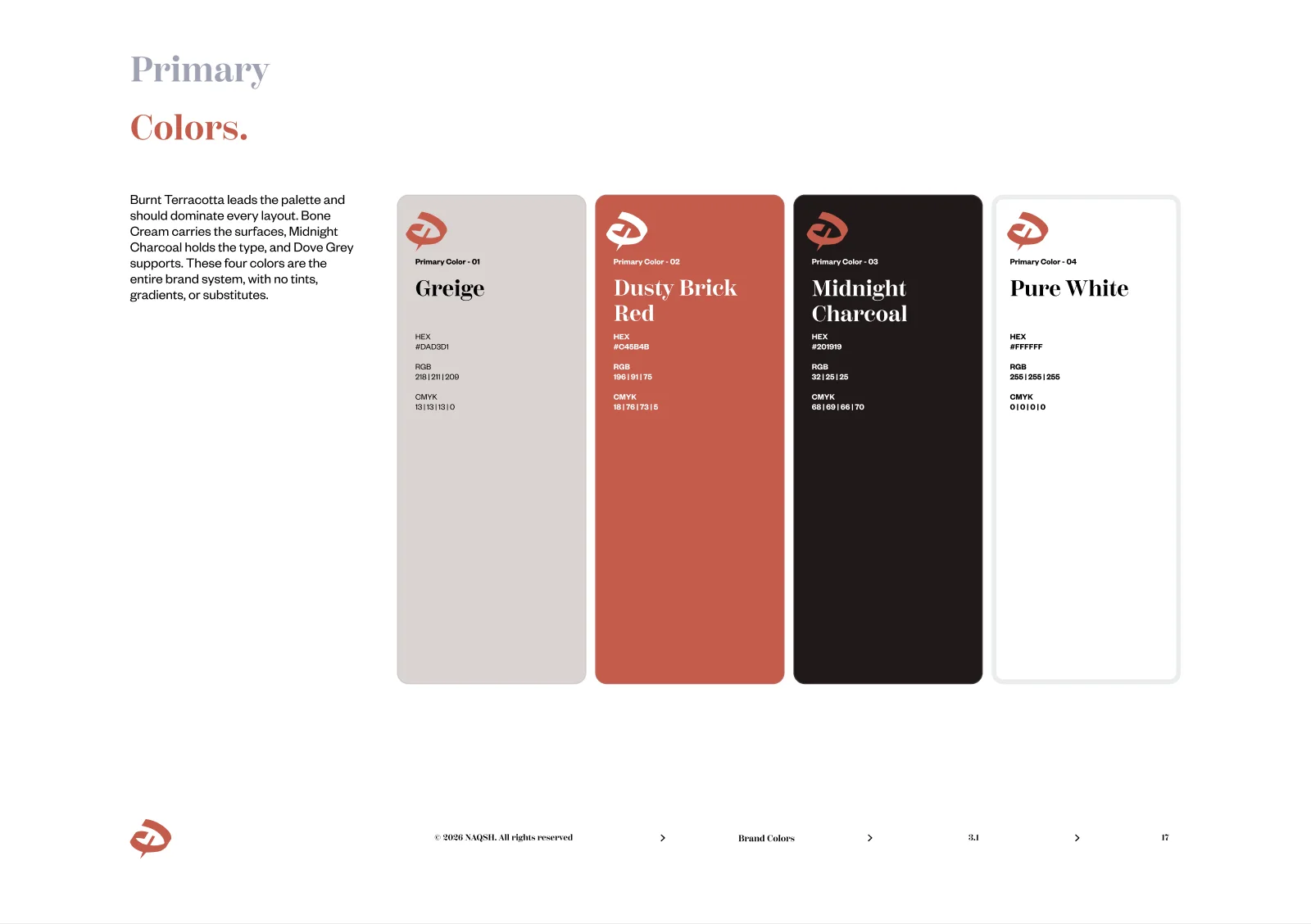
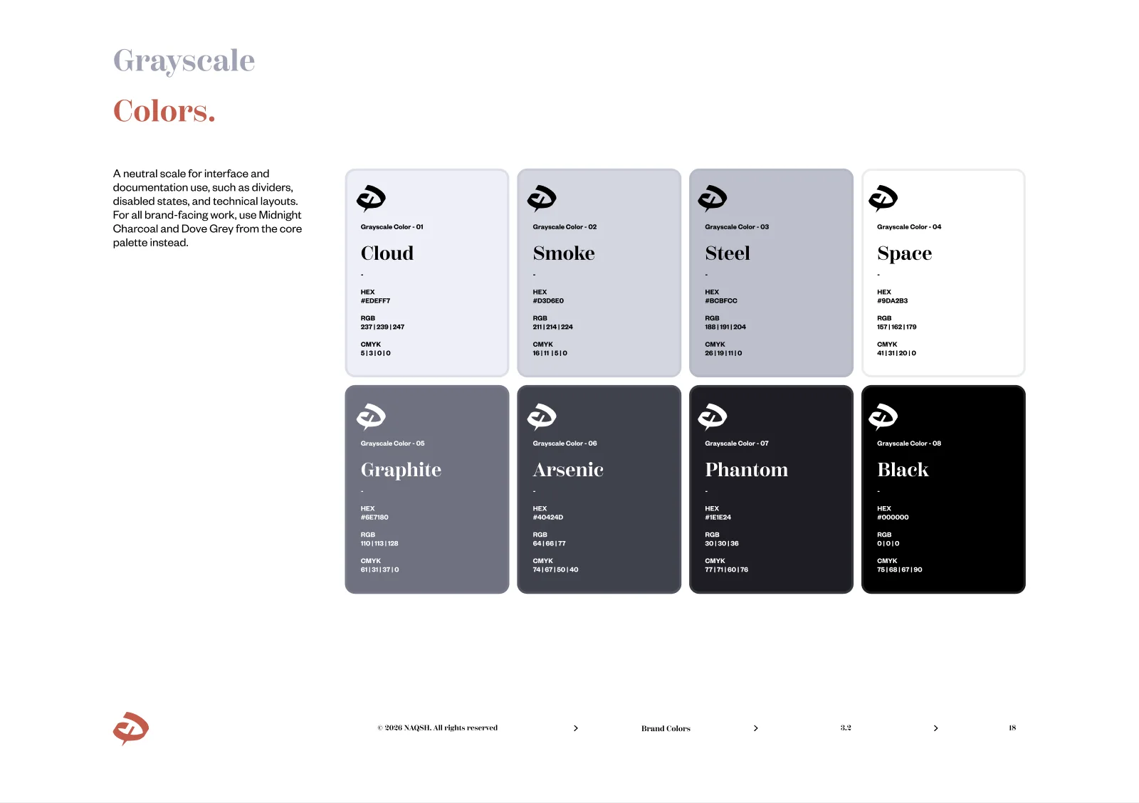
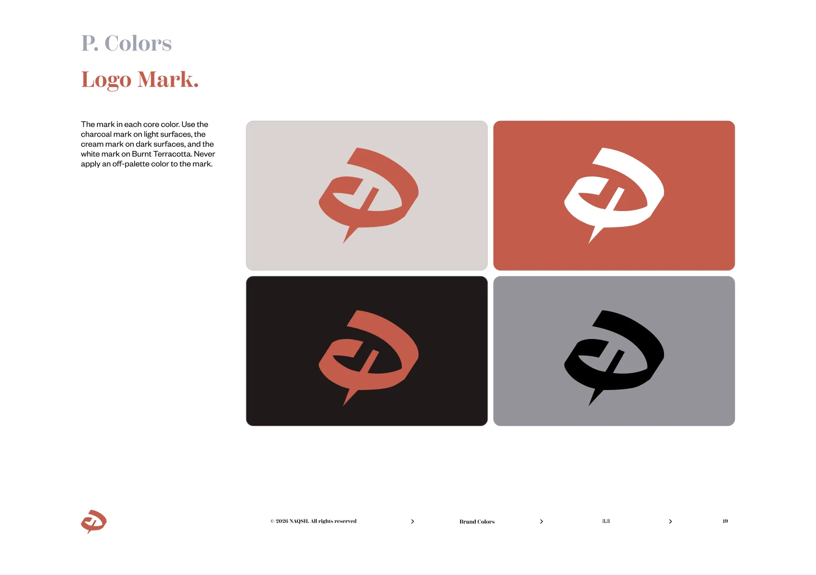
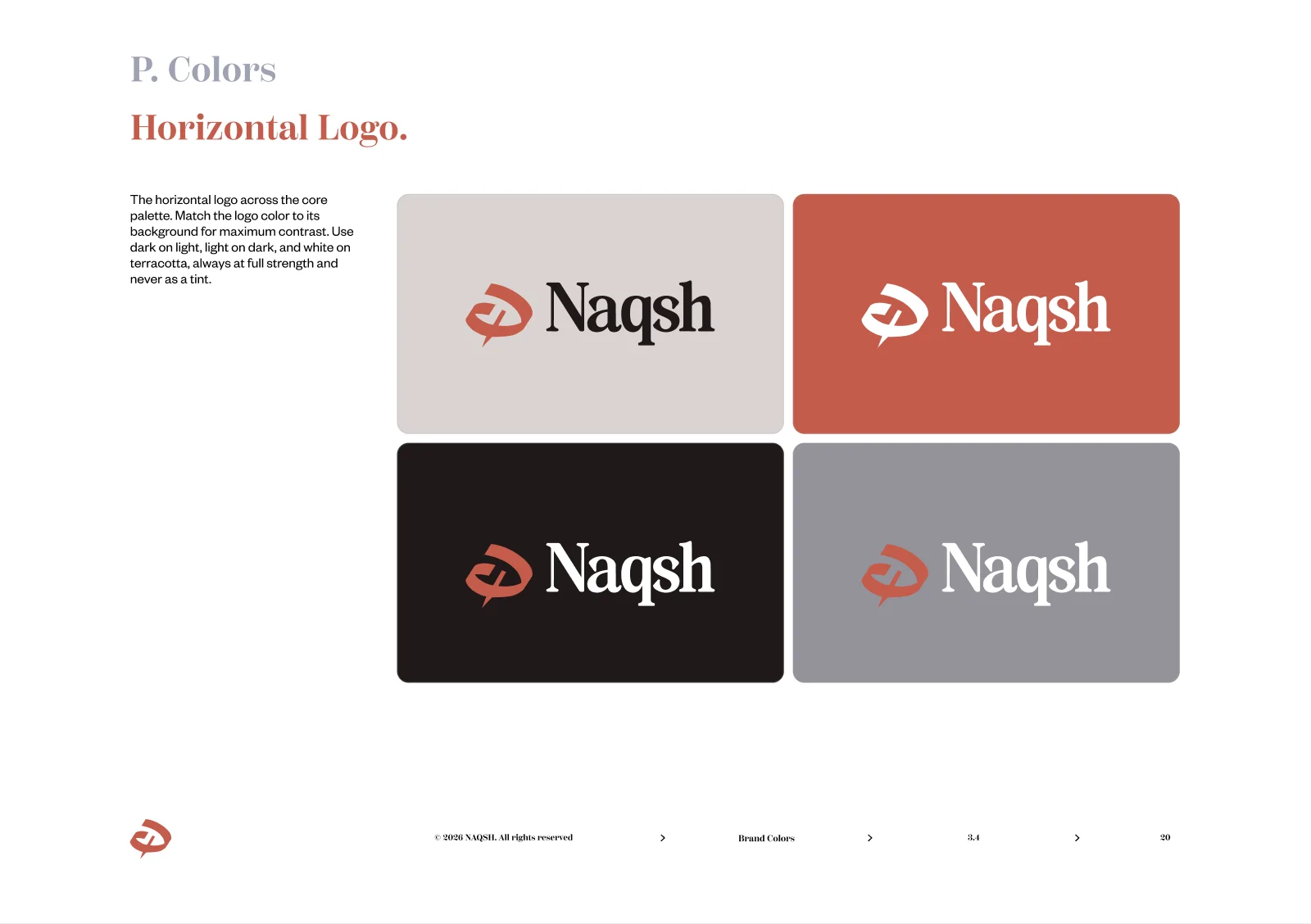
06The Book: Typography
07The Website
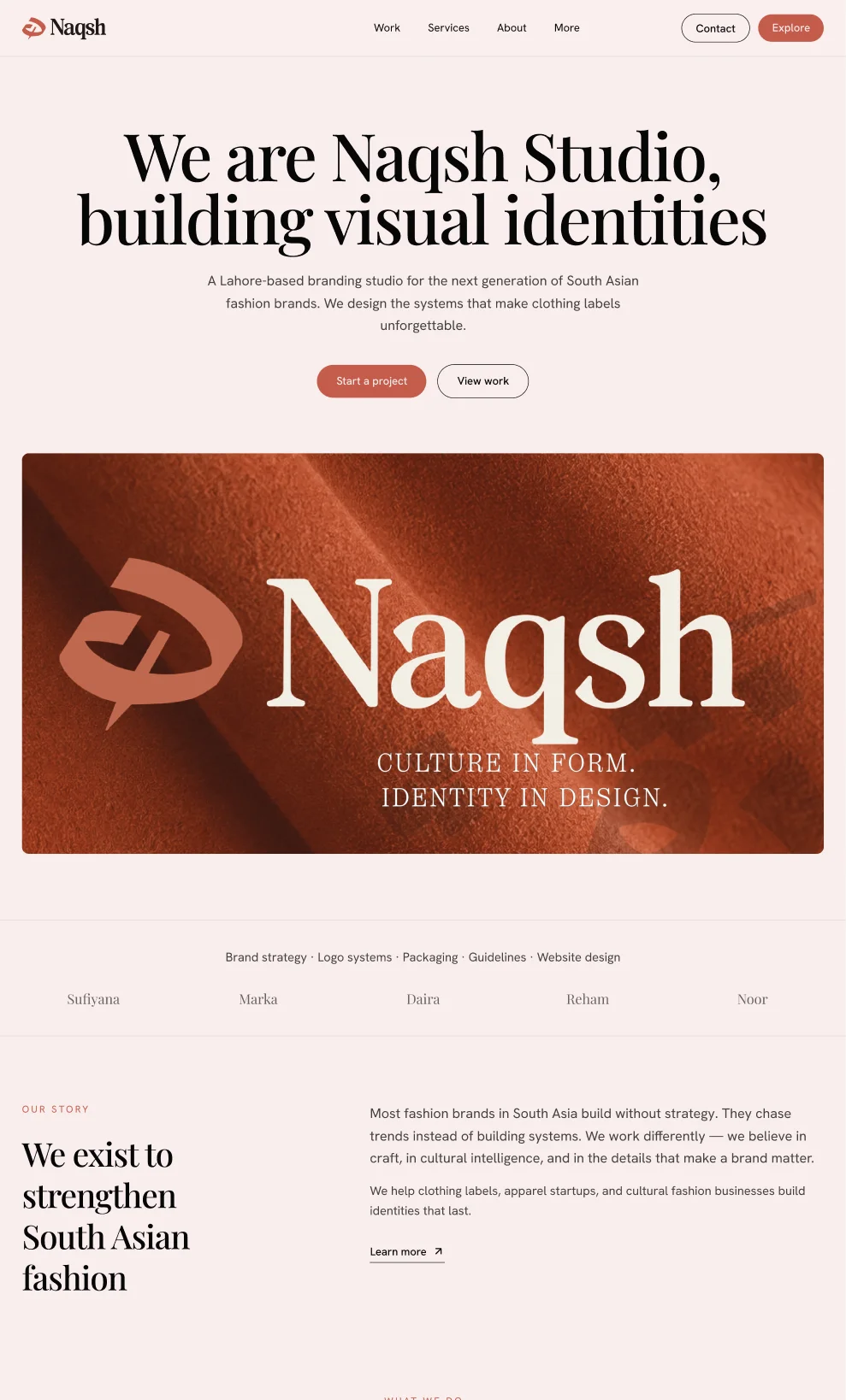
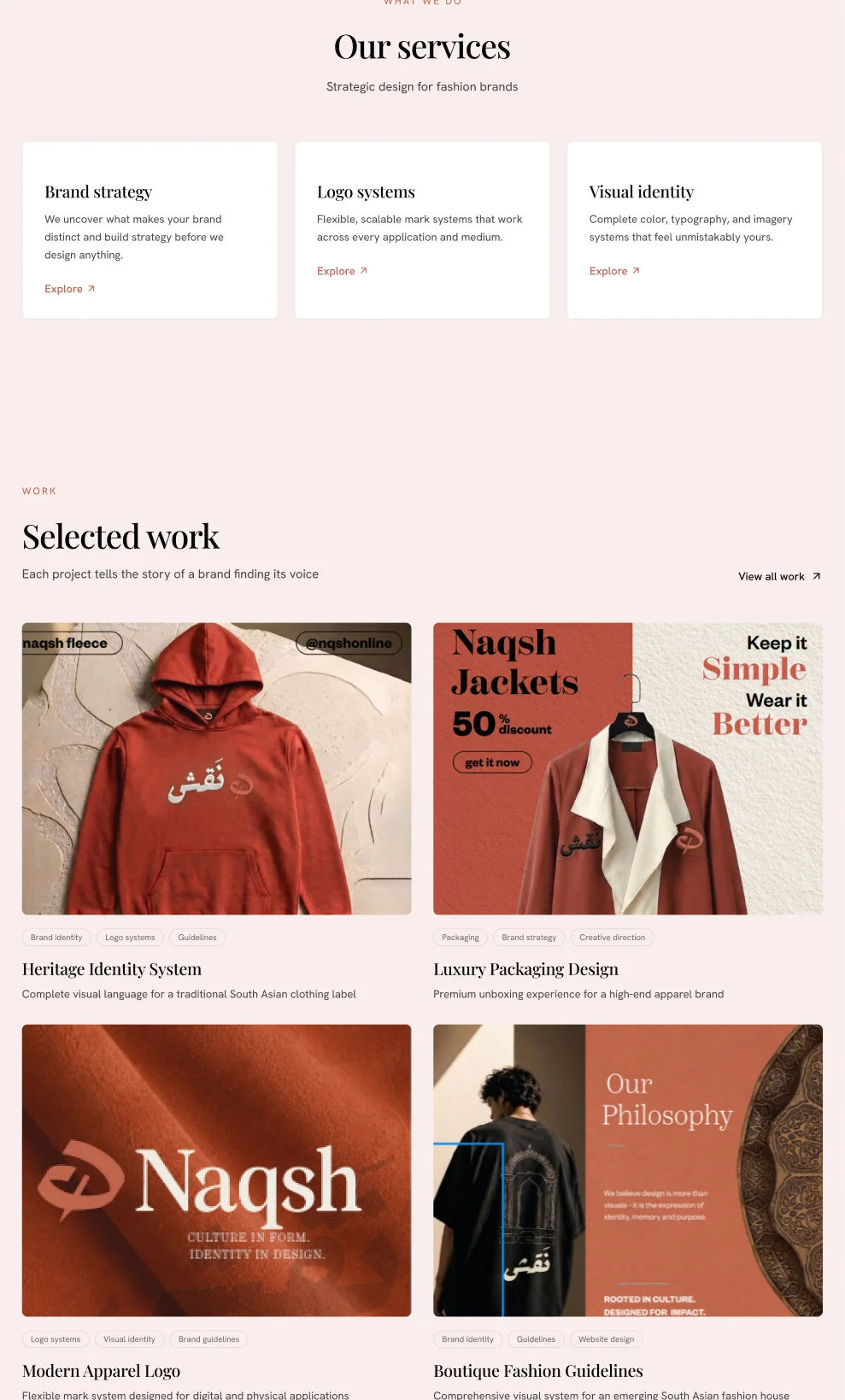
The identity extends to a full studio website: an editorial magazine grid with one hero per scroll, the mark woven through selected work, case studies and the studio journal.
08The Book: Applications
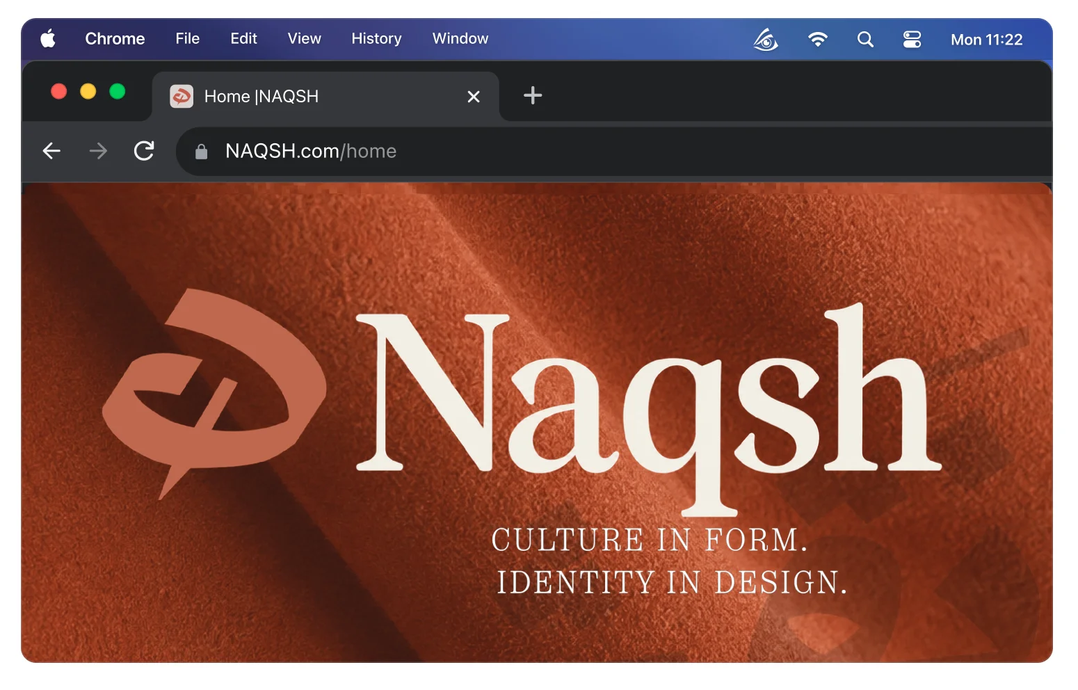
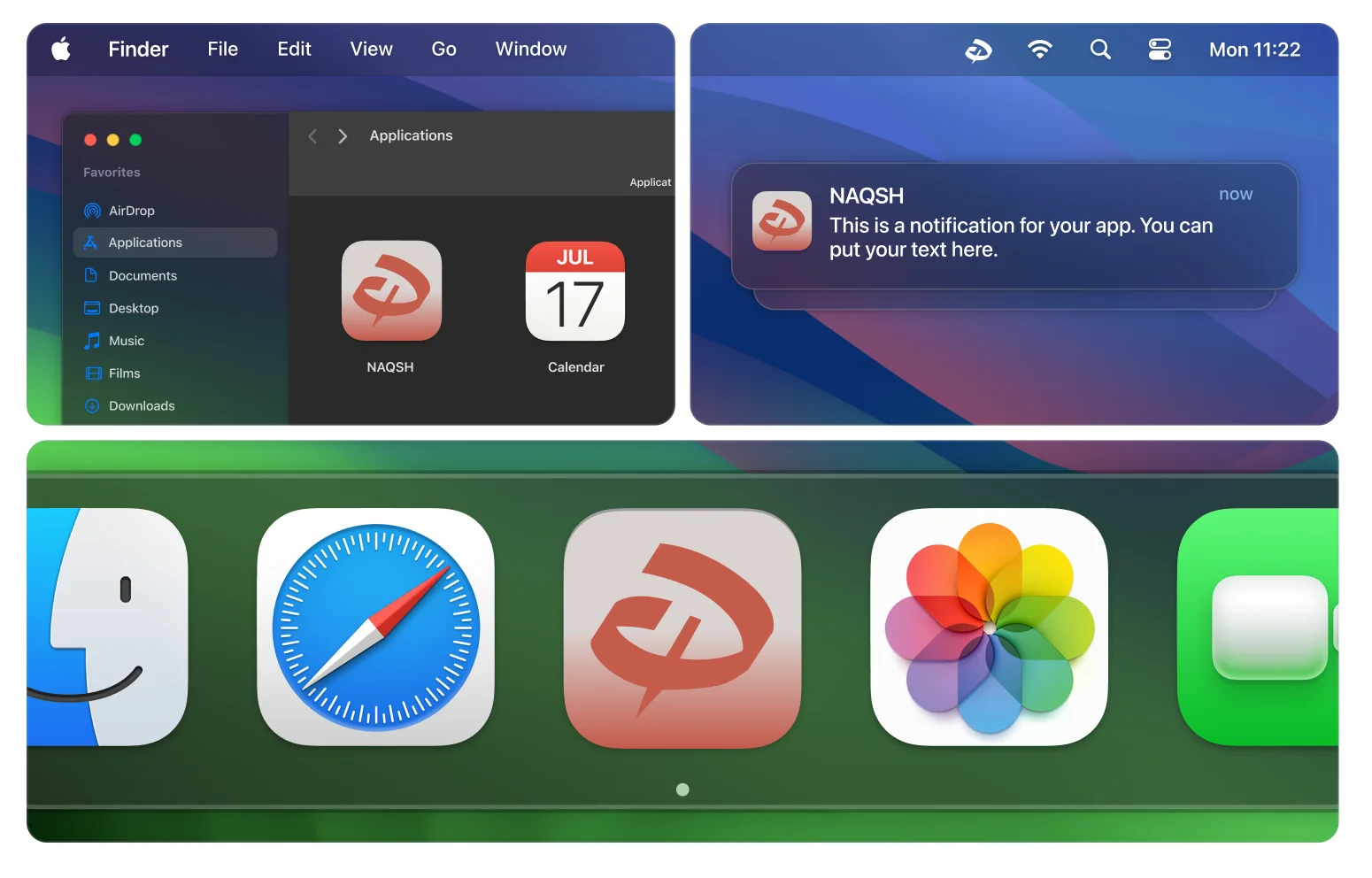
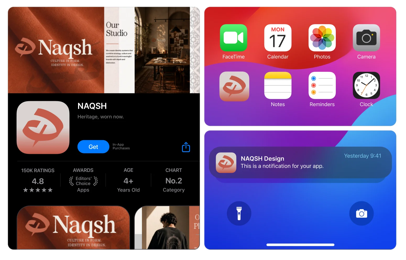
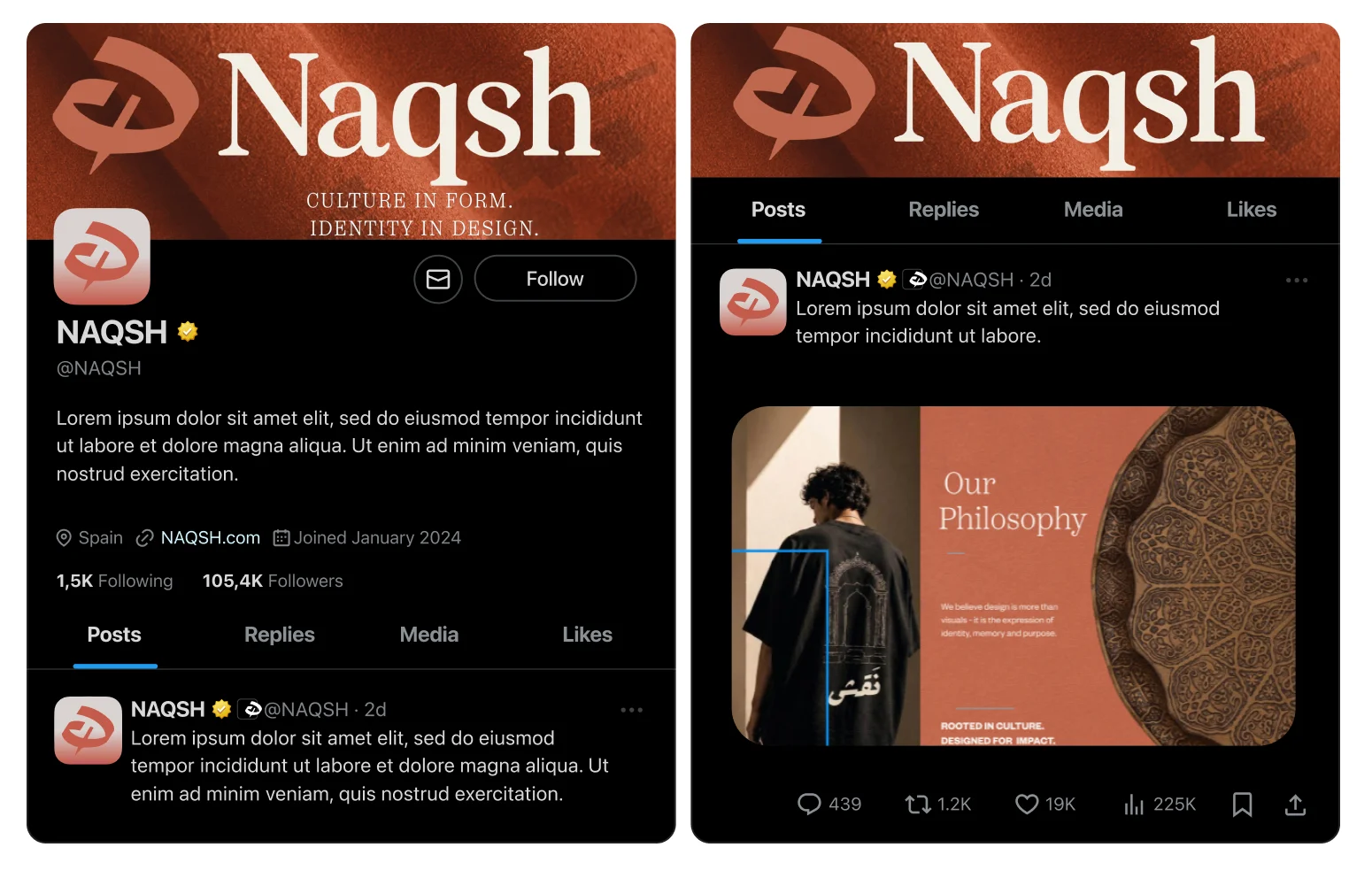
One rule carries every platform: the mark alone on Burnt Terracotta, never the full lockup. In the browser it sits on a solid tile with generous padding so it stays legible at 16px. On macOS and iOS it takes the platform’s own rounded square and safe area. On X and Instagram it lives on a circle, centred in the avatar crop.